A clearer path through complex scientific workflows
DesertSci, Australia

DesertSci, Australia
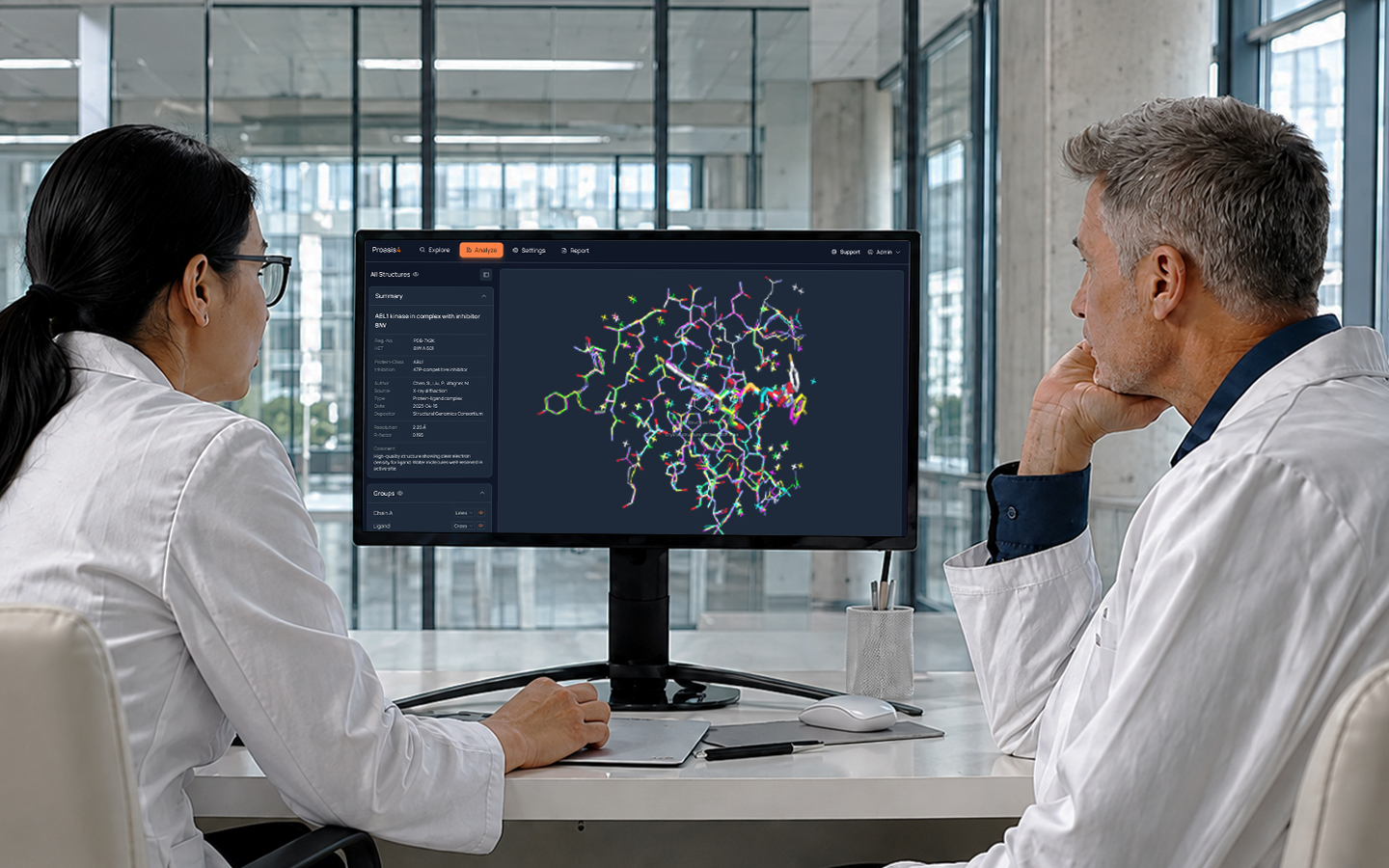
Proasis is a specialist platform for scientific data management and analysis, built for precision, depth, and serious research work. For DesertSci, that power needed to be matched by a clearer, more intuitive experience, one that reduces friction, supports different user types, and presents the software in a way that reflects its sophistication.
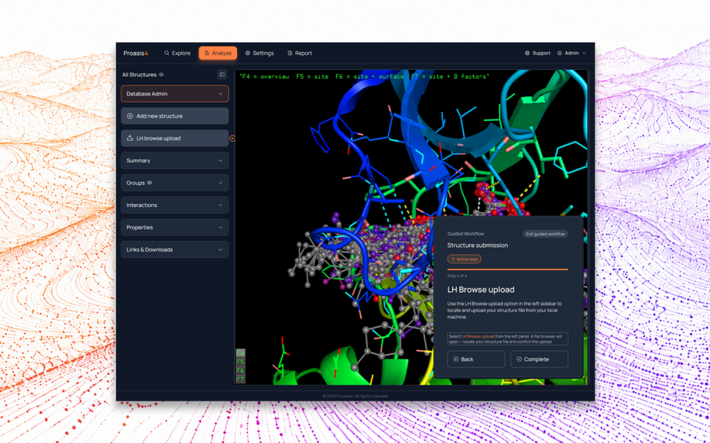
The Walk partnered with DesertSci as part of a broader brand and marketing engagement, one that spanned brand strategy, digital presence, and the full customer experience. Within that project, we reviewed the Proasis interface, identified key usability issues, and redesigned core parts of the experience around clearer navigation, stronger grouping, and more deliberate user flow. The result is a modernised UX direction that positions the platform to be easier to understand, easier to use, and better set up for future growth.
Our role was to transform a dense interface into a structured, understandable experience without losing the professional power that makes Proasis valuable. We approached the project with clear UX goals: reducing cognitive load by logically grouping related actions, establishing a primary navigation model for key workflows, and improving the clarity of screen layouts and controls.
We focused on the practical reality of the platform. As a serious scientific tool, the experience needed to feel efficient and credible rather than over-designed. The resulting interface direction organises the product around how scientists actually work, designed to support onboarding, improve efficiency for experienced users, and give the platform a solid foundation for future evolution.
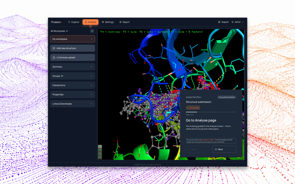
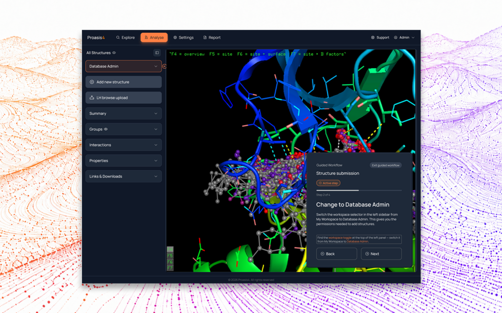
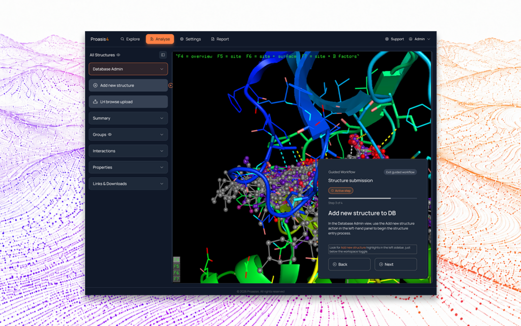
The project began with stakeholder discussions and a thorough review of the current platform to map interface pain points and define clear goals. From that foundation, we developed a clearer information architecture, organising the experience into three intuitive areas: Explore (data and projects), Analyse (structures and visualisations), and System (settings and management).
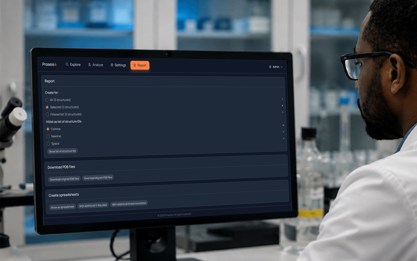
From there, we developed annotated UI concepts, including a refreshed login, a personalised Explore screen, and structured Report views to bring this hierarchy to life. Throughout the process, the emphasis remained on having the right tools grouped in the right context. By moving from an interface where everything competed for attention to one built around deliberate, workflow-focused structure, we helped DesertSci arrive at a modern, implementation-ready UX direction.
By reorganising the platform around clearer workflow groupings and more purposeful screen structures, the redesign positions Proasis to be easier to interpret without compromising its specialist power. By delivering a Bootstrap front-end build alongside the final UI designs, DesertSci received something immediately actionable. Not just a vision, but a working implementation of the new navigation ready to be integrated.
The work delivered:
Just as importantly, the redesign positions the software to better support adoption, onboarding, and future evolution. For a platform built to handle serious scientific work, that clarity matters. It gives new users a clearer path into the product, allows experienced users to work more efficiently, and provides a stronger foundation for future development, including the personalisation and dashboard capabilities already on the roadmap.