
Interactive infographics are a relatively new form of content marketing which has already proven to be effective. Could this be an opportunity for your brand to stand out?
To help you answer this question, we’ll examine the benefits of interactive infographics and show you how they can be put to work for your brand.
What is an interactive infographic?
Information graphics, or infographics, use graphics, icons and illustrations to visualise facts and data in a quick to digest and easy to understand way. Interactive infographics are, most often, long-form web pages which is why they are also called HTML5 infographics. Using dynamic elements such as animations, flip tiles, clickable charts and buttons, they take data visualisation a step further, compared to traditional infographics. As a result, the reader can better understand the story behind your data and is much more likely to engage with your content.
How effective are interactive infographics?
All right! Interactive infographics certainly sound like a powerful marketing tool, but this doesn’t mean that they will work for you. Before hiring a digital marketing agency or a creative agency and producing content, there is one big question to answer,
Is it worth the effort?
Sometimes it’s wise to trust your gut, but data is always better. So, let’s look at the numbers:
of marketers say interactive content is
more effective at grabbing attention.
65% of B2B marketers
use infographics in their content marketing mix.
Why use interactive infographics?
Interactive infographics are a breath of fresh air in our information-overloaded era, because they offer a new way to consume content online. Here are the most compelling reasons to feature interactive infographics in your creative strategy.
Attention-grabbing
Animations and clickable elements are a great way to grab focus and tell a story with data. Also, the reader has a role in the way the information is presented which makes them feel invested in the experience.
Engaging
Interactive infographics are not just visually pleasing but also allow the reader to explore the information at their own pace and engage with the content. Studies have shown that engaged customers are much more likely to buy.
Uncommon
Interactive infographics are not widely adopted yet, which makes them a unique way to communicate your ideas and reach your prospects. As a result, your brand will easily stand out and stay top of mind.
Concise
You can present a substantial amount of information in a clear and comprehensive format. Especially when you want to help readers dissect a complex topic.
Memorable
As the old Chinese proverb goes, “I hear and I forget. I see and I remember. I do and I understand.” Compared to passive content which is just “hearing” or “seeing”, interactive infographics invite the reader to do all three—hear, see and do. Besides, there is ample opportunity to add visual elements that promote your brand identity.
SEO-friendly
It has been suggested before that infographics are dead but studies show that they are still among the most effective ways to generate links. Interactive infographics can have even higher link-generating potential because they are more engaging than static infographics.
Excited already? Let’s look at some examples!
Interactive infographics examples
To help you better understand how it all ties together, we’ve cherry picked the best examples out there. What we liked about them is how they are tailored to a specific target audience.
13 reasons why your brain craves infographics
What could be more appropriate for a start than… an infographic on infographics! This beautiful HTML5 infographic shows the scientific reasons why this type of content marketing is so compelling.
- “Tweet this” buttons throughout the infographic make it easier for readers to share a curious fact.
- Dynamic links to the sources improve credibility.
- The infographic ends with a clever twist: A timer shows how long you’ve been on the page to prove that infographics are effective.
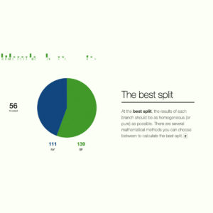
Intro to machine learning
Hot topic? Check. Complex topic? Check. Lack of easy-to-understand information? Check. This infographic illustrates the importance of being in the right place, at the right time. At the time it was published, there wasn’t better content on the topic and, so, it quickly gained popularity.
- Real-world examples make the information easy to digest.
- Hovering over the graphic gives additional information to help engage the audience.
- The original tweet of this article got almost 4,000 retweets and likes.
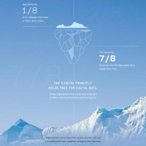
The data that lies beneath
We picked this particular infographic because it uses a captivating concept to grab attention right from the start. Instead of piling on dry facts, the creators decided to compare business data to an iceberg—90% of it is hidden beneath the surface. It’s a memorable comparison that sparks curiosity. Well done!
- A progress bar entices the reader to scroll all the way to the end.
- Clickable elements reveal more information and allow the reader to explore in their own way.
- Case studies reveal the tangible benefits for companies.
How a car engine works
What caught our attention about this infographic was the use of gifs. We couldn’t stop watching them! Seriously, though, gifs are a great way to draw attention and make your ideas easy to grasp. With just a few paragraphs of text, this infographic gives the reader a basic understanding of internal combustion engines.
- Annotated gifs visualise the intricate workings of a car engine
- The content slowly moves from simple to complex ideas
- The combination of static and dynamic elements catches the eye
The savings challenge
Car dealer Arnold Clark uses a witty interactive infographic to educate their prospects on potential money savings. The authors know that “we can help you save 50 pounds” is not a very compelling offer. So, they show the reader what could be done with 50 pounds.
- Humor engages the reader from the very start.
- Emphasis on value makes the marketing message more effective.
- Timely calls to action guide the audience on the path to purchase. The infographic explains how reducing fuel consumption saves money and then offers the reader to browse fuel-efficient cars.
Conclusion
Interactive infographics are a brand-new tool in the content marketer’s toolbox and they are definitely worth experimenting with. The only problem is that it’s easy to waste money and effort on the wrong infographic.
Fortunately, it’s easy to prevent this from happening. Just don’t leave it all to chance! Create a solid content marketing plan to answer questions like:
“Do we really need interactive elements to make a point?”
“How does an interactive infographic tie in with our overall strategy?”
“What aspects of the data will our readers be interested in?”
This is the approach of the true data marketer who creates channel agnostic content and caters to the needs of her audience. If you need help creating a content marketing plan, grab our free guide ”Content Marketing That Works”.







Be the first to comment on "Why interactive infographics are the way ahead"